
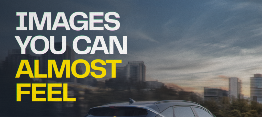
Digital imagery is becoming increasingly tactile.
Across animation, CGI and visual design, we’re seeing more attention to texture, materiality, surface, light and movement. The result is a kind of image that feels more physical, sensory and alive.
After years dominated by ultra-clean and highly polished digital aesthetics, brands and creative studios are exploring visuals with more depth and character. Fibers, scratches, condensation, grain, pores, reflections and small imperfections are becoming part of the visual language.
These details help digital images feel less flat and more tangible.
A tactile image creates the impression that you could almost reach out and touch it.
Material plays a major role. Glass, metal, fabric, skin, liquid, plastic and other surfaces each respond differently to light and movement. When those characteristics are carefully developed, the viewer begins to imagine physical sensations such as weight, softness, temperature and texture.
That sensory response can make an image more immersive and memorable.
CGI gives artists precise control over material, lighting, texture and movement.
A small adjustment in roughness can completely change how a surface feels. Condensation can make an object appear cold. Subtle imperfections can suggest use, age or physical presence. Refraction, reflection and shadows help communicate the properties of a material before the viewer consciously processes them.
This level of control allows digital artists to build images that communicate through sensation as much as through form.
Texture is one of the most important elements behind tactile CGI.
Perfectly smooth surfaces can easily feel artificial. Adding subtle detail creates variation and gives objects a stronger sense of physical presence.
Depending on the project, this can include:
The goal is not necessarily photorealism. These details can work just as effectively in stylized animation, helping establish a specific mood, material or visual personality.
Lighting determines how audiences perceive a surface.
Soft light can reveal the texture of fabric or skin, while sharper highlights can communicate polished metal, glass or plastic. Reflections help describe shape, depth and finish. Shadows establish volume and weight.
Strong lighting design makes materials easier to understand visually and helps create a more convincing sense of space.
Animation makes tactile qualities even more expressive.
Fabric folds and stretches. Water moves and reacts. Hair shifts. Light travels across surfaces. Materials bend, break, melt, expand or compress.
These reactions provide clues about weight, elasticity, density and resistance.
Movement can therefore transform materiality into an experience, giving audiences a stronger sense of how an object might behave in the physical world.
In a digital environment filled with polished images competing for attention, materiality can help create distinction.
Tactile visuals can make products feel more desirable, environments more immersive and brand worlds more recognizable. They also give artists another way to communicate personality through craft.
For animation studios and creative teams, this opens up a broad field of experimentation across CGI, motion design, mixed media and other forms of digital production.
Texture, material, light and movement are becoming increasingly important parts of contemporary visual storytelling.
The screen may still be flat, but the image doesn’t have to feel that way.
As imagens digitais estão ficando cada vez mais táteis.
Na animação, no CGI e no design visual, textura, materialidade, superfície, luz e movimento vêm ganhando mais espaço. O resultado são imagens com uma presença mais física, sensorial e viva.
Depois de anos marcados por estéticas digitais muito limpas e polidas, marcas e estúdios criativos passaram a explorar visuais com mais profundidade e personalidade. Fibras, riscos, condensação, granulação, poros, reflexos e pequenas imperfeições começam a fazer parte dessa linguagem.
São detalhes que ajudam a tirar a imagem da sensação de superfície plana e aproximá-la de algo mais tangível.
Uma imagem tátil cria a sensação de que seria possível quase tocá-la.
O material tem um papel central nisso. Vidro, metal, tecido, pele, líquidos e plástico respondem de formas diferentes à luz e ao movimento. Quando essas características são bem trabalhadas, o público começa a imaginar sensações como peso, maciez, temperatura e textura.
Essa resposta sensorial pode tornar a imagem mais imersiva e memorável.
O CGI oferece um alto nível de controle sobre materiais, iluminação, textura e movimento.
Uma pequena mudança na rugosidade pode alterar completamente a percepção de uma superfície. Condensação pode transmitir frio. Imperfeições sutis sugerem uso, tempo ou presença física. Refração, reflexos e sombras ajudam a comunicar as propriedades de um material antes mesmo que o espectador perceba conscientemente esses detalhes.
Esse controle permite criar imagens digitais que também se comunicam pela sensação.
A textura é um dos principais elementos por trás de um CGI mais tátil.
Superfícies perfeitamente lisas podem parecer artificiais com facilidade. Detalhes sutis criam variações e dão aos objetos uma presença física mais convincente.
Dependendo do projeto, isso pode incluir:
O objetivo nem sempre é alcançar o fotorrealismo. Esses recursos também funcionam muito bem em animações estilizadas, ajudando a definir atmosfera, material e personalidade visual.
A iluminação influencia diretamente a forma como percebemos uma superfície.
Uma luz suave pode destacar a textura de um tecido ou da pele, enquanto brilhos mais marcados ajudam a comunicar metal, vidro ou plástico. Reflexos descrevem forma, profundidade e acabamento. Sombras reforçam volume e peso.
Um bom trabalho de iluminação torna os materiais mais legíveis e fortalece a sensação de espaço e presença.
Na animação, as qualidades táteis ganham ainda mais força.
Tecidos dobram e esticam. A água reage. O cabelo se movimenta. A luz percorre superfícies. Materiais podem entortar, quebrar, derreter, expandir ou comprimir.
Essas reações ajudam a comunicar características como peso, elasticidade, densidade e resistência.
O movimento transforma a materialidade em experiência e aproxima o espectador do comportamento físico daquele objeto ou ambiente.
Em um ambiente digital cheio de imagens extremamente polidas disputando atenção, a materialidade pode ajudar a criar diferenciação.
Visuais táteis podem tornar produtos mais desejáveis, ambientes mais imersivos e universos de marca mais reconhecíveis. Também ampliam as possibilidades criativas para artistas e diretores construírem identidade através do craft.
Para estúdios de animação e equipes criativas, esse movimento abre espaço para experimentação em CGI, motion design, mixed media e outras formas de produção digital.
Textura, material, luz e movimento estão ocupando um papel cada vez mais relevante na construção de imagens contemporâneas.
A tela continua sendo plana. A experiência visual não precisa ser.